Dining Out, Safely
- Company
- Personal Project
- Duration
- Apr 2025
- Team
- Solo
- Role
- Research, Data Processing, Map Design
We love dining outdoors — soaking up the sun, the breeze, and the city vibes. But keeping that chill vibe means also being aware of your surroundings. In some parts of Toronto, a relaxing patio experience can come with potential safety concerns.
Potatio offers a list of the hottest restaurants in the city and how safe each area is, based on recent reported crime data. The interactive platform works across desktop, tablet, and mobile, making it easy to access on the go.
Try It
Feature Highlight
Instant insight: clusters + colours for smarter scanning
Restaurants are grouped into clusters based on location density, and each location and its neighbourhood are colour-coded by surrounding crime level. Users instantly understand how many dining options are nearby and how safe the area is, all in a single glance.
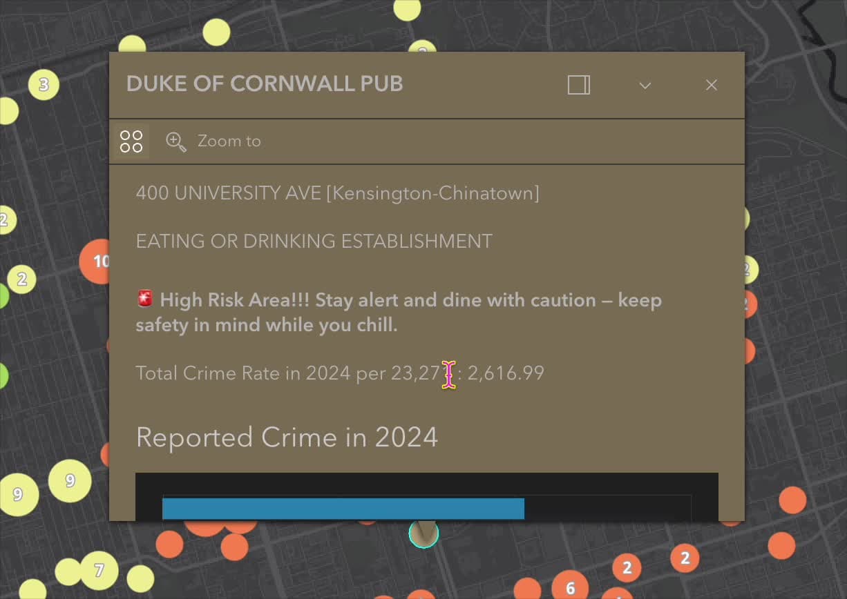
All for your safety: the detailed information card
The pop-up info card shows detailed restaurant information, a safety rating, and related neighbourhood context like the amount of reported crime.
Data Processing Flow
Potatio uses two publicly available datasets from the City of Toronto — Neighbourhood Crime Rates and CaféTO Locations — cleaned separately in Excel, then joined and classified in ArcGIS.
Neighbourhood crime rates
To calculate the crime safety level around each restaurant, I processed and refined the neighbourhood crime dataset from the City of Toronto. The original dataset contained crime counts and rates across various types of offences for each Toronto neighbourhood, split by year.
Filtering relevant crime types
Potatio focuses on meaningful safety insight for people dining outdoors, so I prioritized crimes most likely to affect the perceived safety of public, open-air spaces. Auto Theft and Break and Enter were removed as a result, leaving five public-facing crime types:
- Assault
- Homicide
- Robbery
- Shooting
- Theft Over
Latest data
Only the 2024 data was used, so Potatio reflects the most recent and relevant safety conditions. Sticking to the latest year helps users decide based on the current environment, avoiding outdated trends and keeping the platform timely and trustworthy.
CaféTO locations
Potatio integrates data from the City of Toronto's CaféTO program, which gives licensed eating and drinking establishments the opportunity to expand their outdoor dining space. The dataset is refreshed monthly, providing accurate, up-to-date listings of sidewalk and curb-lane cafés and patios.
Data filtering
The CaféTO dataset includes comprehensive business registration details — operator name, intervention type (curb lane, sidewalk, or private property), business address, licence number, and the ward and BIA the patio sits in.
Location extraction for mapping
To prepare the dataset for mapping and risk analysis in ArcGIS Online, I extracted and reformatted the geometry into usable longitude and latitude fields. A spatial join with the neighbourhood crime rates dataset then linked each restaurant's location to the crime rate of its surrounding area.
Classify risk level
To produce meaningful, visually intuitive safety categories, the total crime rate for 2024 in each neighbourhood was classified using the mean and standard deviation (σ) as thresholds rather than arbitrary cut-offs.
mean total crime rate per 100,000 people (x̄)
standard deviation (σ)
range across Toronto neighbourhoods
Detailed pop-up cards
The pop-up cards were customized with ArcGIS Arcade attribute expressions, turning a raw crime rate into a plain-language risk message — and, for clusters, into a readable list of the restaurants inside.
Limitations and Future Development
While Potatio successfully visualizes the relative safety of restaurant locations based on neighbourhood crime rates, one limitation is its current inability to account for restaurants located near the edges of multiple neighbourhoods.
Originally, I aimed to create a buffer around each restaurant and analyze overlapping neighbourhood boundaries to generate a more context-sensitive crime score. Due to constraints in spatial join compatibility and data structure within ArcGIS Online, that approach couldn't be fully implemented. As a result, each restaurant is assigned the crime rate of the single neighbourhood it falls within, which may oversimplify safety assessments for locations near boundary lines.
Future versions of Potatio could improve accuracy by incorporating advanced spatial analysis that accounts for these edge cases.
Interested in working together?
Let's talk about your project.